expression case study...
...the Generation Demand story
A new cutting edge marketing consultancy, which helps companies do marketing that drives more demand, challenged us to develop its logo, brand identity and online presence that showcases what its business is all about.
...the Generation Demand story
A new cutting edge marketing consultancy, which helps companies do marketing that drives more demand, challenged us to develop its logo, brand identity and online presence that showcases what its business is all about.
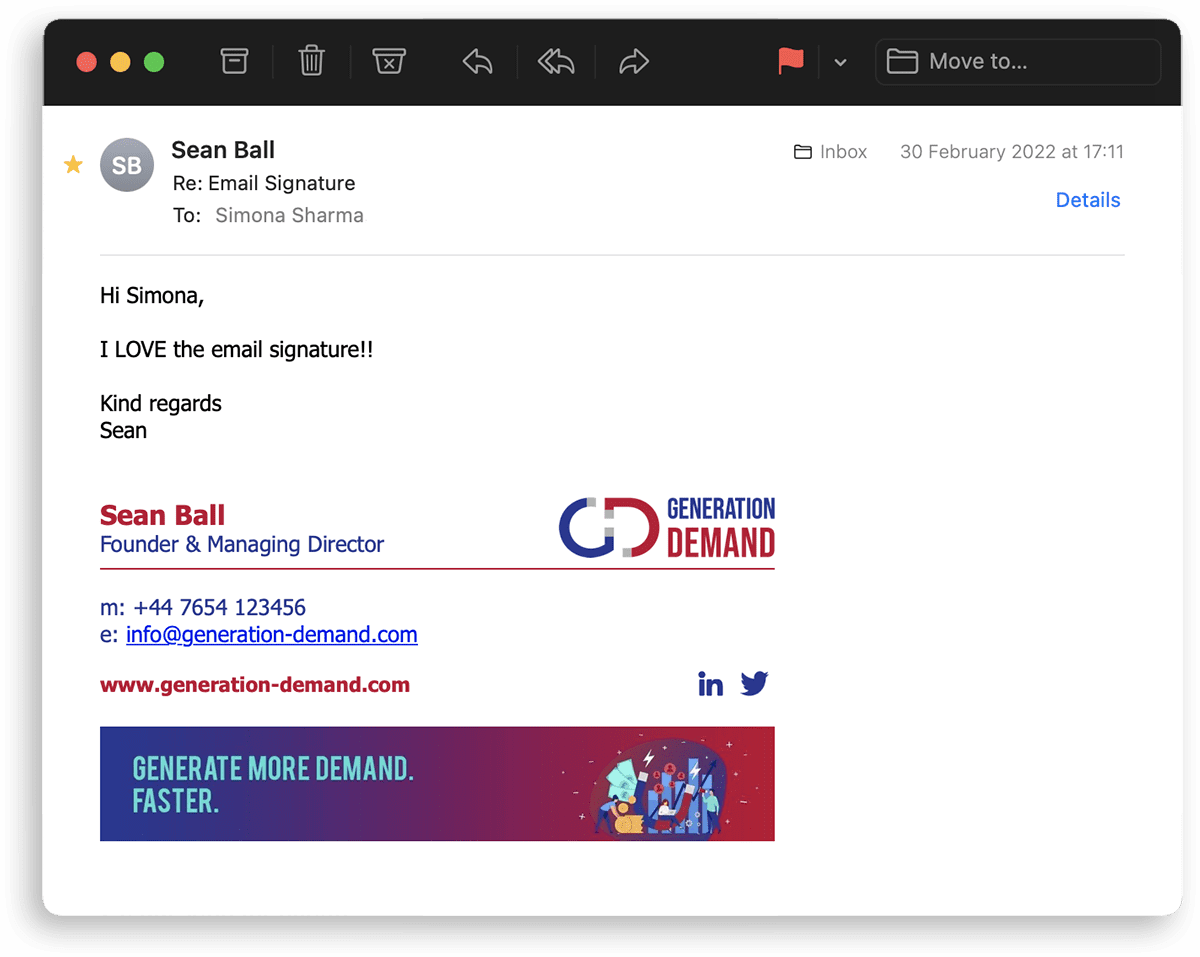
With the slogan "Generate More Demand. Faster.", Generation Demand is a bold and straight to the point consultancy that aims to help businesses reach and attract more prospective customers.
With that in mind, we developed the brand based on ferrous magnets emphasising on their quality of attraction. It's easy to understand and has an instant connection to what the business delivers. The initials G and D have been modified to look like magnets and are used in the logo along with the wordmark.
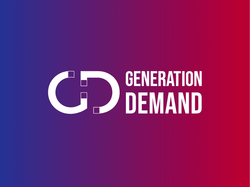
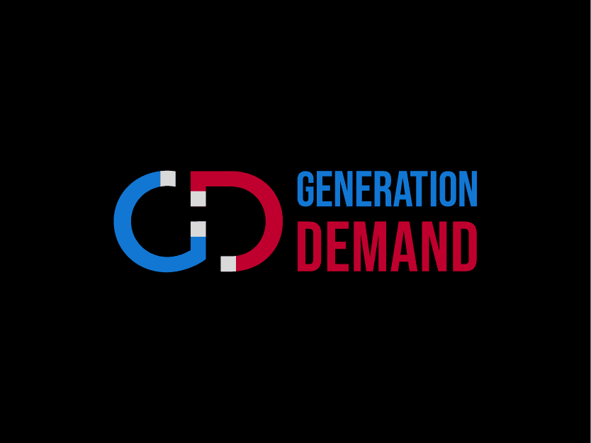
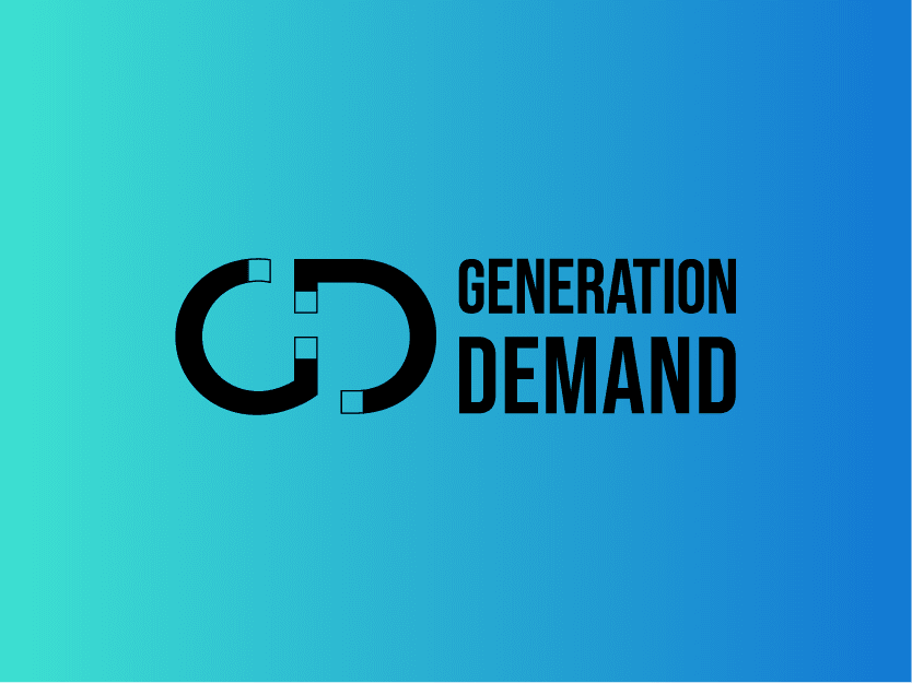
In order to make the brand feel lively and exciting, yet powerful and bold, we chose colours like turquoise and purple alongside red and blue. We chose shades of the core colours that blend with each other quite fluently and form the corporate colour palette that squarely conveys their ethos and energy.
As a result, the overall appeal of the brand looks modern, punchy and quite unique. We'll let you be the judge.
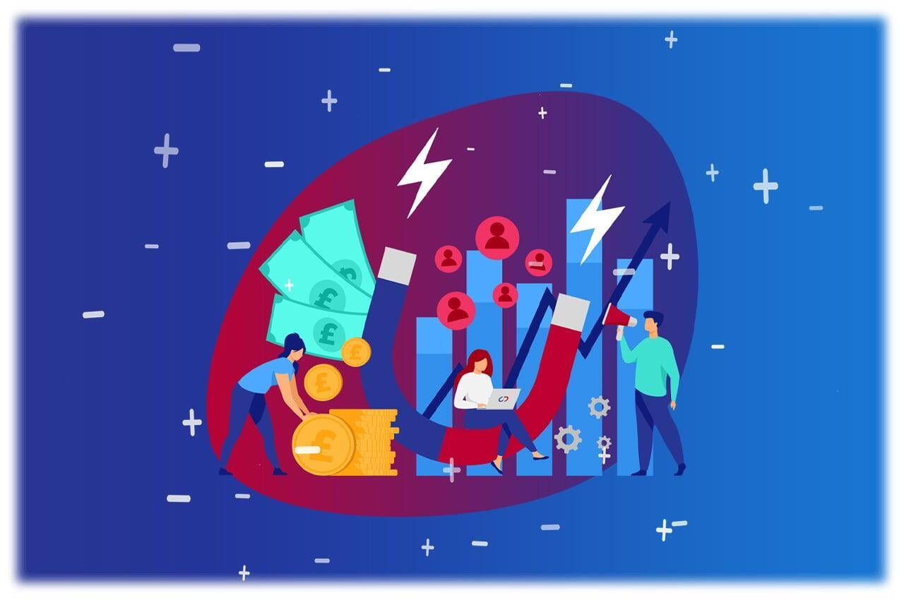
We developed the website for Generation Demand www.generation-demand.com that showcases the vibrance and boldness of the brand. The custom artwork and illustrations help visualise what the consultancy does and portrays the brand as approachable, easy to understand and fun.
We used the magnet based brand concept primarily for the animations. They help to visualise the service that the business delivers i.e. attracting market demand. And to make the overall appearance of the website look upbeat and lively, we used dynamic shapes and gradients.
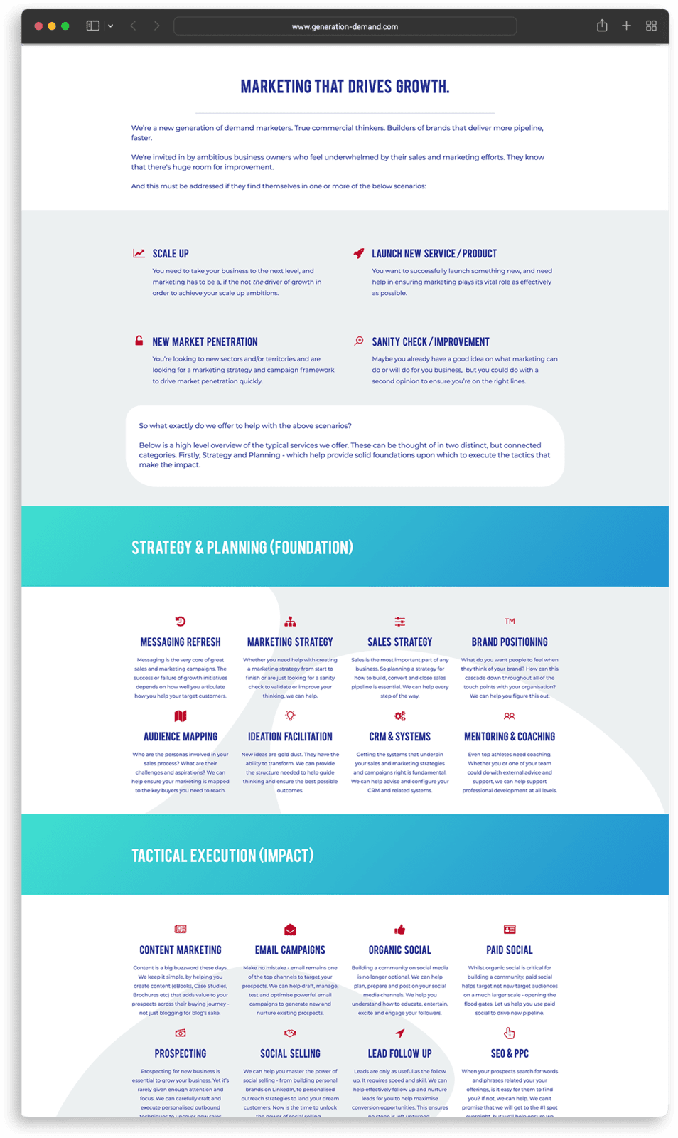
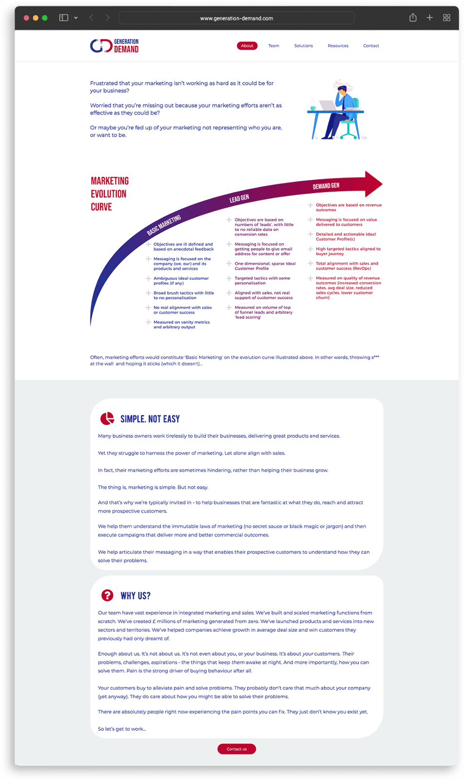
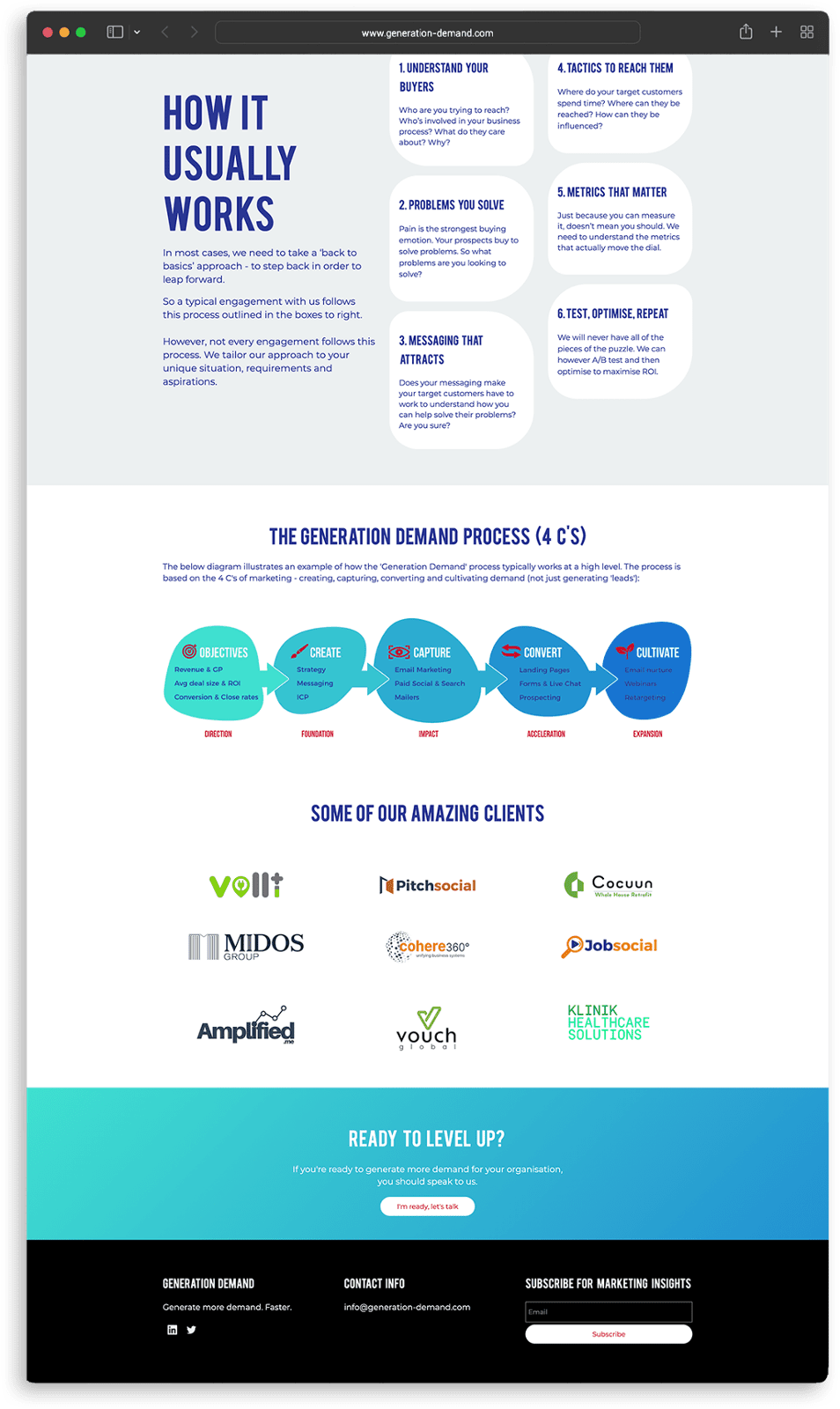
Together with varying layouts, bold capital headings, rounded shapes, icons and bright calls to action, the illustrations and animations in an all encompassing and captivating website, we created a user experience that delivers a complex subject matter in a way that is highly engaging and very easy to understand.
Testimonial
Cohere360° were absolutely instrumental in getting my business going. We worked closely from brainstorming the brand name to going through various logo ideas, finalising the look and feel of the brand and implementing it on my website. I am in awe of the diverse skillset Cohere360° can offer. They are able to give a sound advice and fulfil every need for my business.
Founder & Managing Director Sean Ball